क्रिएटिव फ़ाइल
Fundamentals of Oil Pastel Artistry
Oil pastels represent a distinctive bridge between drawing and painting. Many artists prefer them over other color media due to their specific physical properties. While they share some DNA with traditional soft pastels, they also exhibit traits reminiscent of wax crayons, offering a versatile experience for creators. It is important to distinguish between the two primary categories of pastels: oil-based and soft (chalk) varieties. Although they share some overlapping application methods, their chemical compositions and behaviors on the page are fundamentally different.
Theodore Montgomery
निर्माता
फ़ाइल नोट
नीचे पूरा ट्यूटोरियल या लेख पढ़ें।
मॉड्यूल
डिजिटल कला
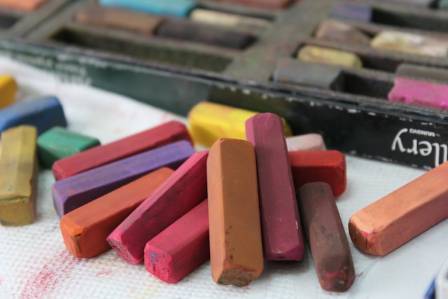
Oil pastels represent a distinctive bridge between drawing and painting. Many artists prefer them over other color media due to their specific physical properties. While they share some DNA with traditional soft pastels, they also exhibit traits reminiscent of wax crayons, offering a versatile experience for creators. It is important to distinguish between the two primary categories of pastels: oil-based and soft (chalk) varieties. Although they share some overlapping application methods, their chemical compositions and behaviors on the page are fundamentally different.
Defining the Medium
The composition of an oil pastel consists of raw pigment bound together by linseed oil. This oil-heavy consistency results in a creamy, "painterly" texture. Because of this, working with oil pastels often feels more like painting than sketching, and a completed piece frequently carries the visual weight and richness of an oil painting. Even though the application involves a dry stick, the final result is often classified within the painting tradition.
Unlike soft pastels, which are dry and powdery, oil pastels are stable and less prone to smudging into dust. However, this density makes them more challenging to manipulate with a blending stump or a finger. While layering is possible, artists must be cautious; applying excessive material can lead to "muddy" tones. Furthermore, heavy layers can sometimes "pull up" the pigment underneath rather than sitting on top of it, necessitating a thoughtful approach to color placement.
Essential Application Techniques

Initially, an oil pastel may feel like a standard crayon when first applied to a surface. However, as the artist builds up layers, the material transforms into a buttery substance that mimics paint. To achieve the best results, consider these strategic steps:
First, establish an underpainting to define the basic light and dark values, which serves as a foundation for local colors. Second, focus on layering to create depth in both hue and value. Third, build up the material gradually; rushing the application of thick pigment often results in unintended color mixing. Finally, use the background to define and sharpen the edges of your subject, effectively "cleaning" the silhouette of the central image.
Selecting the Right Surface
Artists can apply oil pastels to a variety of substrates, including canvas, cardboard, and masonite, though paper remains the most popular choice. The "tooth," or surface texture, of the paper significantly influences the final aesthetic. A rougher texture allows for more pigment to be trapped in the fibers, facilitating multiple layers and creating a sense of depth, though it may appear grainier. Conversely, smoother surfaces yield sharper lines but accommodate fewer layers.
Many professionals prefer working on toned paper rather than stark white. Starting with a neutral, middle-value surface allows the artist to push the highlights and shadows in either direction more effectively. Additionally, allowing snippets of the paper's color to peek through the strokes can add visual complexity and harmony to the work.
A Step-by-Step Exercise: Drawing an Apple
To understand the practical application, consider the process of rendering a simple fruit. Begin with a loose, light sketch using a neutral brown to establish the basic form. From there, identify the areas of deepest shadow and apply initial colors like dark reds or yellow ochre.
To deepen the shadows without losing clarity, apply a dark brown followed by a colorless blender—a stick containing the oil binder without pigment. This tool allows the colors to merge into smooth transitions. For the darkest points, apply black with a very delicate touch, then blend it into the reds to maintain a natural look.
Proceed to the lighter areas by applying white for the primary highlights and yellow ochre to boost color intensity. For the cast shadow on the surface below the object, a blend of dark brown and blue creates a "cool" shadow effect. Finally, use a light color or white to refine the outer boundaries of the subject, ensuring the edges are crisp and the form is well-defined against the background.
Exploring Landscapes
Oil pastels are exceptionally well-suited for creating expressive, textured landscapes. Because the medium allows for rapid color blocking, large areas of a composition can be filled quickly. These sections can then be refined and reworked throughout the process to build atmospheric depth.
When working from a reference, artists should feel free to deviate from the exact colors of a photograph. By emphasizing certain hues or altering the lighting, you can create a piece that feels more evocative than a mere reproduction. Whether taking a detailed approach or an Impressionistic one, the buttery nature of the pastel allows for a vibrant, energetic finished product.
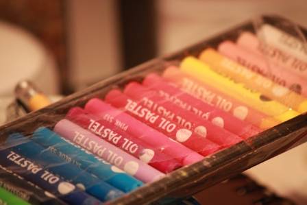
संबंधित फ़ाइलें

The 2025 Singapore Grand Prix: Key Takeaways from F1’s 18th Round
AUTH: Elowen
Essential Koala Information: Key Insights
AUTH: Oliver
Watercolor Flower Tutorial: A Beginner’s Guide to Vibrant Florals
AUTH: Winifred Mae Kingsley
5 Health Benefits of Drinking Black Tea
AUTH: Cory
एक बढ़ती हुई क्रांति
AUTH: रियान
रात के आसमान में देखने के लिए 7 सबसे बेहतरीन, सबसे खूबसूरत आकाशगंगाएँ
AUTH: दिशा